Chapter 1. Clean Look and Feel
The output from the DocBook xslTNG Stylesheets is designed to be clean, semantic HTML with accessibility features wherever possible. The online presentation is driven by modern, widely-available CSS and JavaScript APIs.
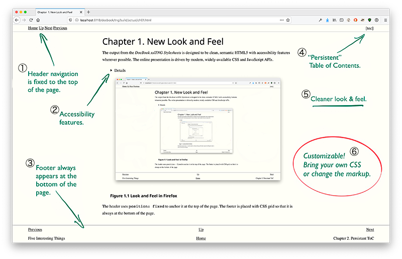
Screenshot of the new look and feel as rendered in Firefox. There’s a header across the top with Home, Up, Next, and Previous links. There’s a footer across the bottom with similar navigation features divided into a three column table: Previous on the left, Up and Home in the center, and Next on the right. The titles of preceding and next pages are shown in the footer.

- ①
The header is fixed to the top of the page so navigation links are always available.
- ②
Accessibility features include long descriptions of images and tables, alt-text for images, and headers for table rows and columns. Where JavaScript is used, reasonable non-JavaScript fallbacks are provided.
On short pages, the footer always floats to the bottom of the page.
- ④
The “persistent ToC” feature puts the whole document’s Table of Contents within easy reach on every page.
- ⑤
The design is generally cleaner. There are different and slightly larger fonts, the column width never exceeds a practical reading width, and media queries make the design responsive to the narrower displays on phones and tablets.
- ⑥
The focus on clean, semantic markup means that you can create new (and better!) styles with CSS. You can also write stylesheet extensions to customize the markup, to add additional details to the header and footer, for example.